The Sanctify App
Empowering a seamless value alignment investment experience
An app that provides informative, convenient, and delightful purpose investing and stocks/ETFs screening services
Role:
Group Design Lead
Researcher & UX designer
Timeframe:
July - Nov, 2022
Estimated Launch Time:
End of 2023
My Internship -
Starting in July 2022, I had the chance to participate in a fintech app design project from 0 - 1. This internship was a really rewarding experience, and I would like to thank my team and the lead.
During this 4-month internship, we redesigned Sanctify’s main features by scoping main use cases, exploring potential solutions, and regularly syncing our proposals with cross-functional team members. As a design assistant, I worked closely with the project lead and teammates to ensure we met our client’s needs.
Below, I will present an overview of our design process. If you would like to learn more about my experience, feel free to contact me! I will also reveal more details here at a later stage.
About the Project -
The Problem
Catholics have been very poorly catechized about money and faith. For the average Catholic, it is exceedingly difficult to self-manage investing let alone integrate Catholic Values into one’s investments.
About Sanctify
Backed up by IWP Capital, Sanctify is a mobile investment platform that makes faith-based investing accessible to the modern, everyday Catholic, or even general investors. Users will be able to screen over 20,000 securities, open accounts, and buy, sell, direct index, and evaluate investments in terms of how companies protect life, promote human dignity, act justly, enhance the common good, and provide care for the environment. Our client plans to utilize the new app to attract new users and increase their user base.
V1 App
Web App
Product Scope
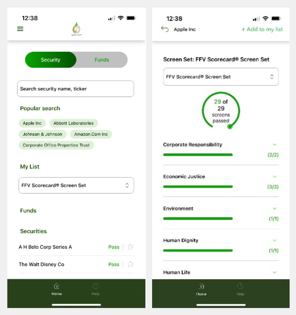
For the MVP version, we only provide the FFV scorecard as the rule to do the screening. Users could use the FFV scorecard to identify whether a security/fund is against their belief and then make the investment in our Sanctify app or via other investment apps, such as Robinhood or Stash.
FFV Scorecard
Main Use Cases
Able to screen a fund from Morningstar universe
Search and screen a stock directly from IWP universe, and then get the result immediately
View daily/monthly/yearly performance
Check account balance

Therefore, we first came up with our design goal:
How might we design a mobile experience that encourages users to explore, screen securities/funds, and invest with purpose?
The Process —
Week 1: Competitive Analysis
Our team started by conducting a competitive analysis. We basically analyzed features’ user flows and layouts to get familiar with the domain knowledge and find some design inspirations.
Week 2: Visual Style Exploration
We moved mood boards and font exploration upfront because our clients wanted to set the visual style early to promote business on their websites and social media.
Color Palette
Typography
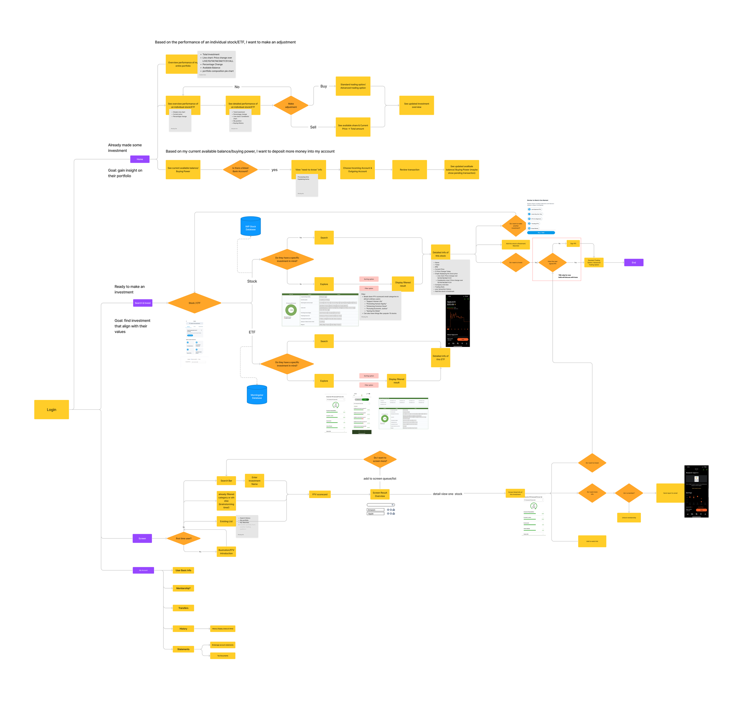
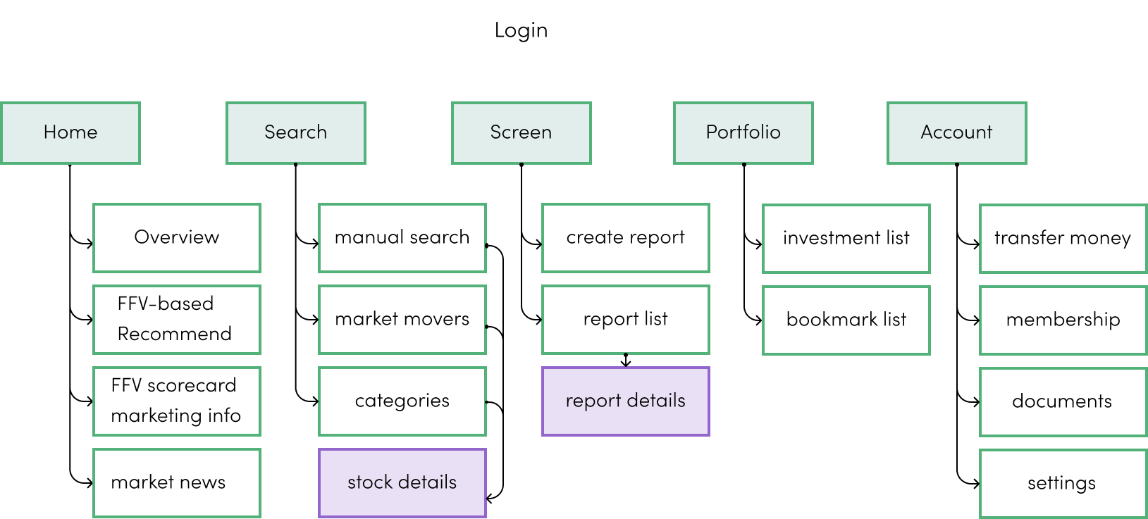
Week 3 & 4: IA & User Flows
Our team was divided into 3 groups covering 5 features at a later stage. Before diving deep, we brainstormed all functions’ IAs and user flows together. We first looked into their V1 app and web application to learn about how basic functions work under technical support and limitations.
Current Problem: After digging into the conventional investing process and the client’s previous version, we found 3 main factors causing low engagement: uncandid, complicated, and boring.

Thus, we reset our design goal to be:
Design an informative, convenient, and delightful mobile experience for users, where they can do purpose investing and screening.
When we brainstormed user flows and information architecture, we proposed the following design principle to guide our design decisions during the entire process:
How might we make investing with impacts more accessible to users?
User Flow at Exploration Stage
Information Architecture
Week 5 - 11: Wireframe explorations - Screening
Task of my group: the screening feature. We brainstormed several page layouts based on the defined user flow and then created simplified versions through several rounds of iterations.
Our initial proposals were a little complicated as we made lots of connections to other sections, trying to foster a seamless value screening experience.

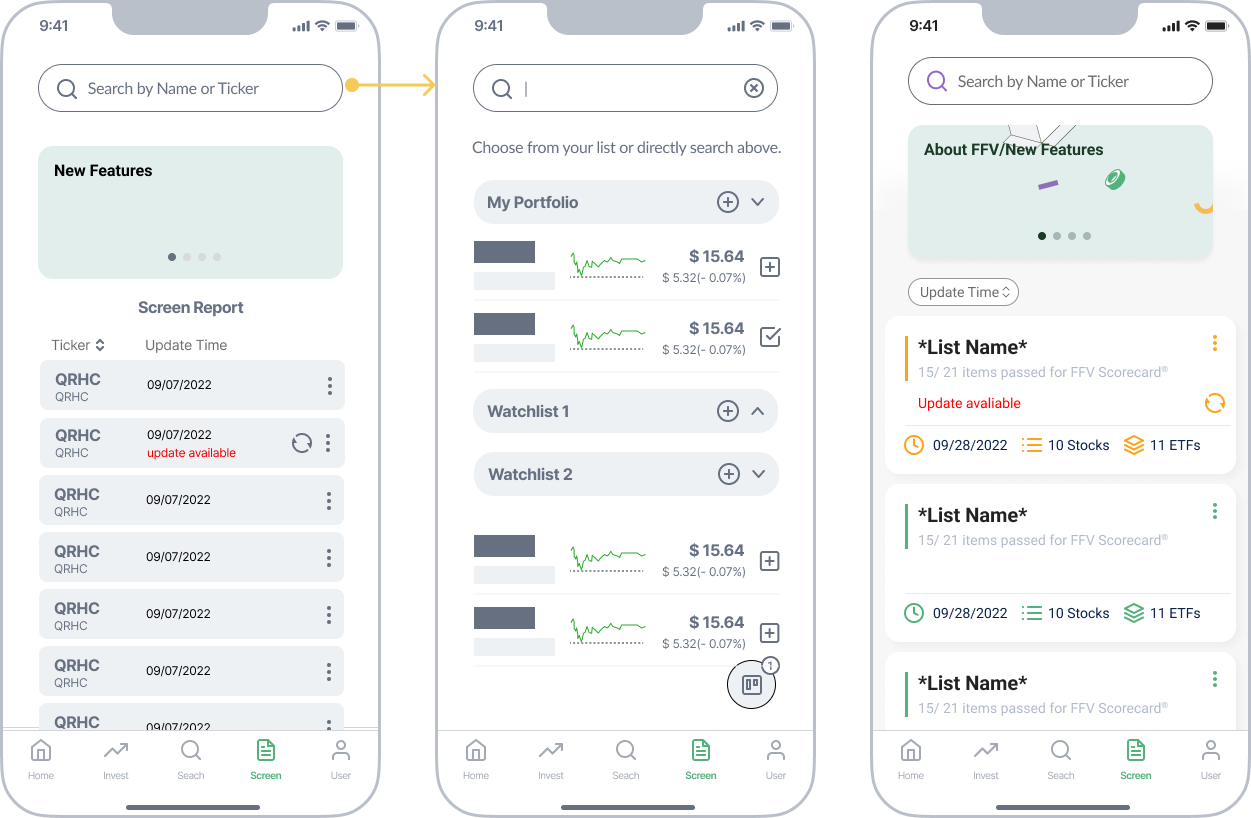
Screen Homepage
V1: Exploratory Screening
Screen by categorized, suggested and customized lists
V2: “Shopping Cart”
Add items and lists to a cart to process screening
V3: Only 1-time Screen List
Move cart and suggested lists into Search
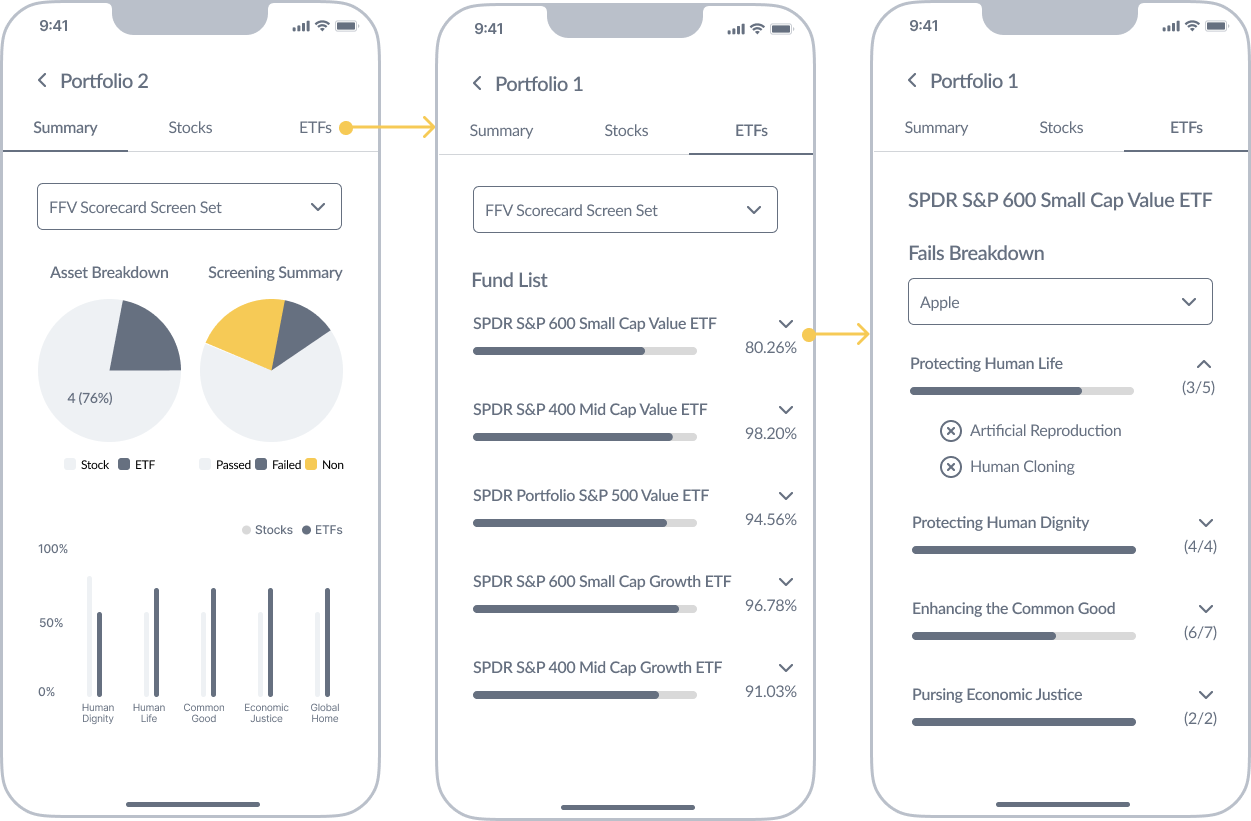
In-app Report Details
V1: Exploratory Screening
Present summarized and critical result insights
V2: Intuitive Display
More visual elements to inform FFV results
V3: Fun Interactions
Explore more types of FFV results display

Due to the project scope and technical limitations, we redefined the specific design goal for screening:
How can we make the generating report feature independent and intuitive?
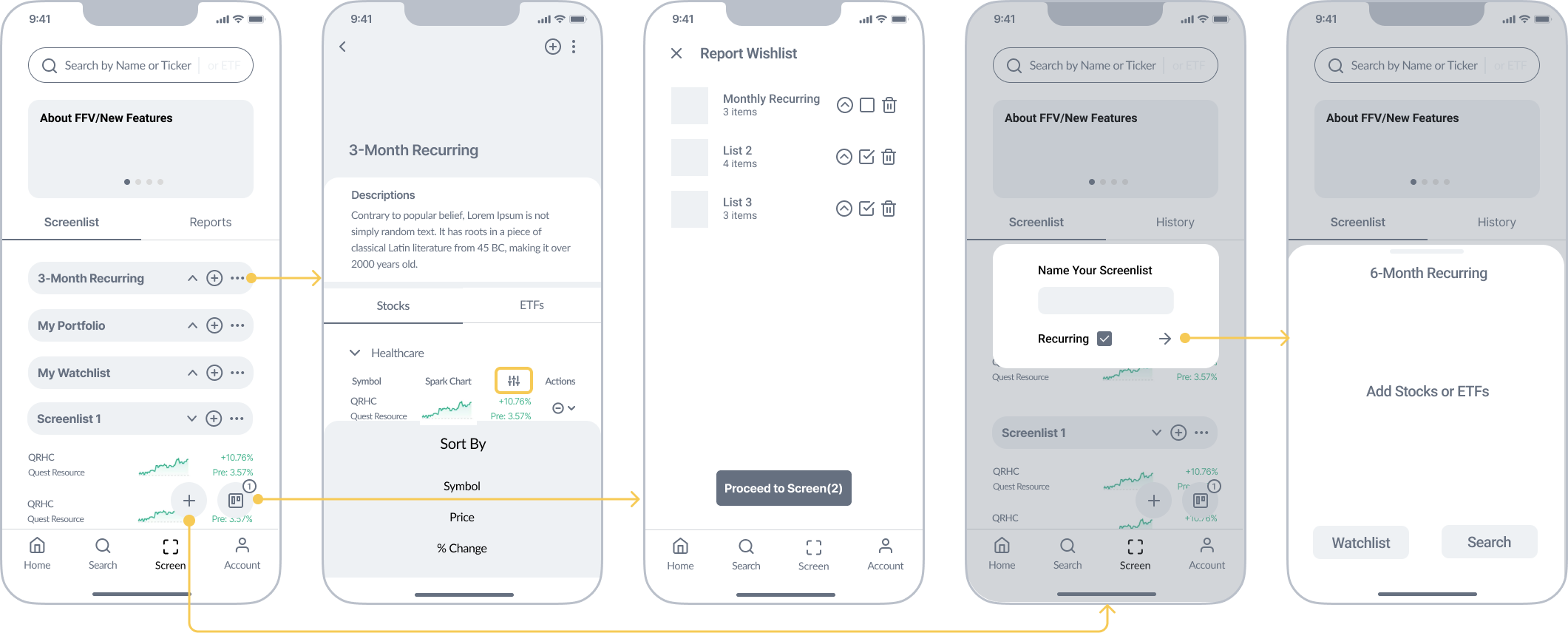
Week 12: Redefined User Flow and Wireframe - Screening
Step 1: Clarify
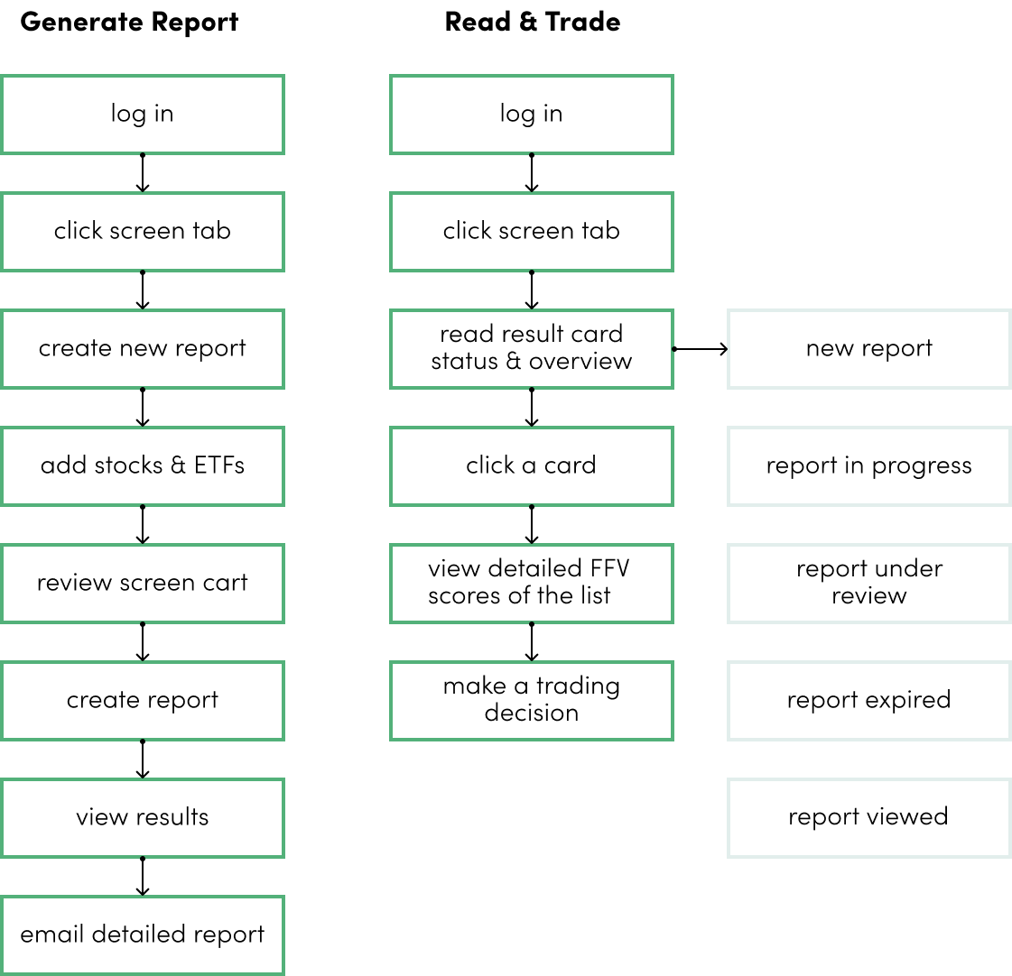
To better design the core experience for Sanctify, we clarified the user flow from “screening onboarding” to the “report viewing” by identifying two key scenarios:
① generate reports
② trade with report
Step 2: Simplify
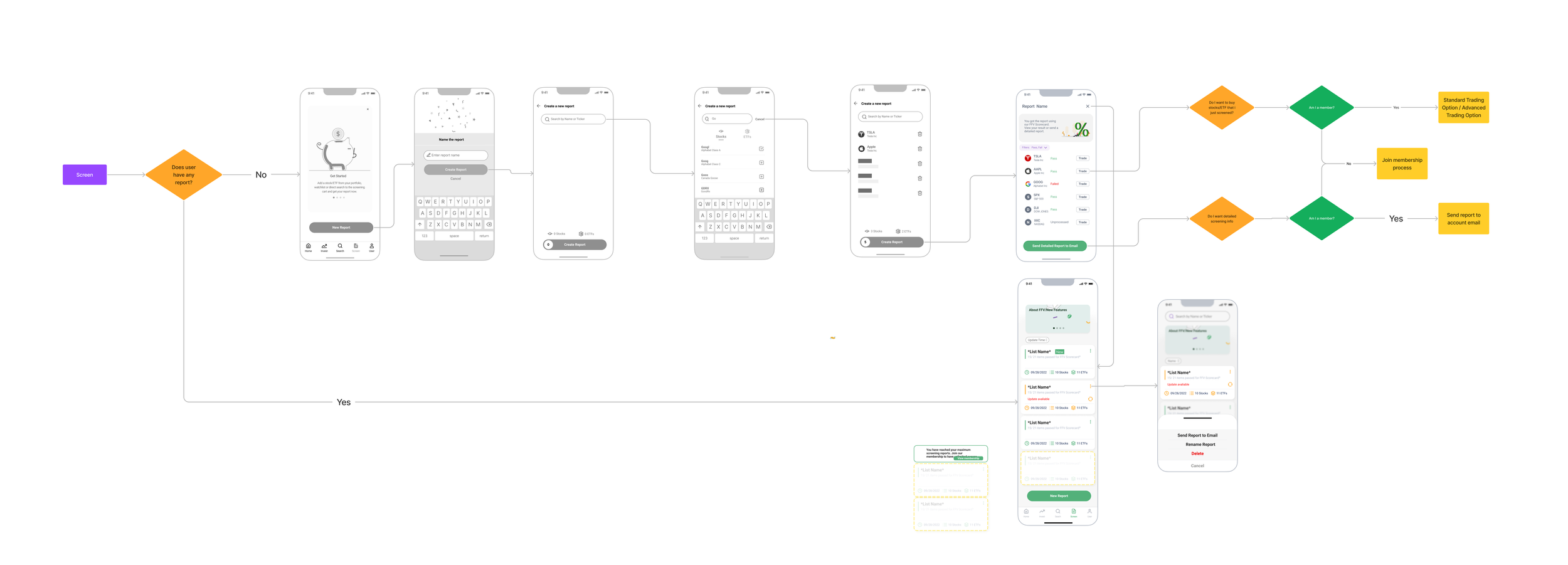
We reorganized and redesigned a simplified wireframe based on a clearer user flow.
Step 3: Fill in
We expanded the wireframes by adding details, including onboarding, empty and different processing states, and fun interactions to ensure a more seamless value screening experience.
Week 13-16: Hi-fi Exploration - Screening
Meanwhile, we also explored visual style and elements, such as colors, icons, labels, and illustrations, to help best inform users of the processing status.
Week 17: Present the finalized design to our client
We wrapped up our design with a formal presentation to our client, and we got great feedback: “I kept thinking WOW! It really is a dream come true.” We will continue working with the engineering team if they need any support during the development process.

Finalized Design —
Scenario 1:
Generate Screening Report
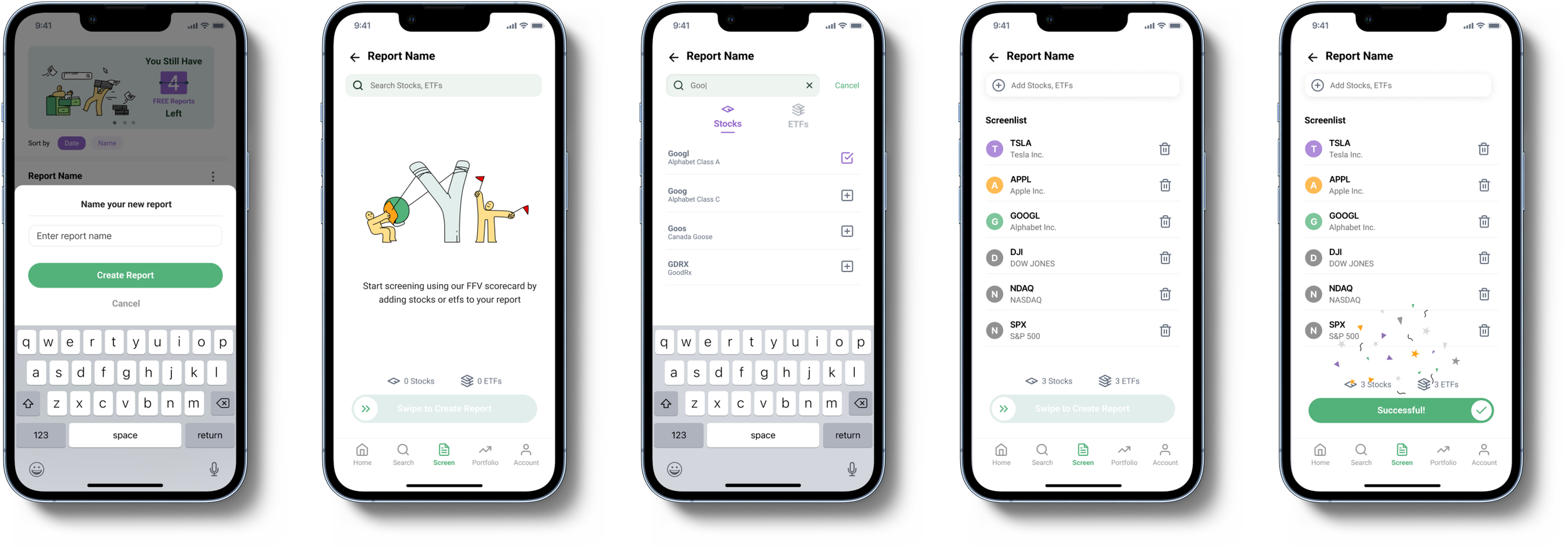
An intuitive process like an online shopping experience of adding stocks and ETFs to a cart and swipe to check out as creating a new FFV screen report
Scenario 3:
Read FFV Scorecard Results
Display the result with typical paradigms of P/F for easy understanding, send report details to email with one click, and streamline the trading experience
Scenario 2:
Report Status Overview
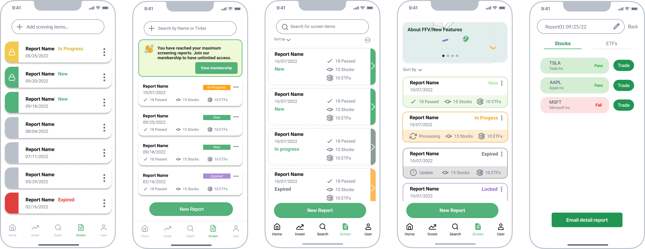
The screen homepage lists all reports as cards for overview. Colors, labels, and icons quickly inform the status of the report, along with an items summary.
Onboarding Process
An educational and joyful onboarding experience and start with flexibility.
Design System
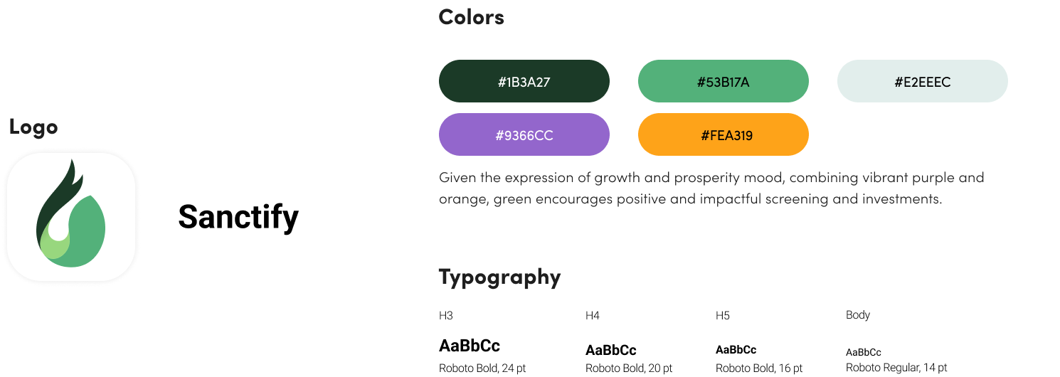
Use vibrant colors and simple icons to facilitate the informative and joyful experience of value-based investments.
Future Tentative Features
Similar stock suggestions and in-app detailed reports
My Contribution —
Lead the Screening Feature Design
It was a rewarding experience to take the lead role in designing Sanctify’s core feature: screening. During the past 4 months, I took responsibility for major design work, organized internal group meetings, and regularly synced with our project lead in terms of design progress and iterations based on previous feedback.
Provide Cross-functional Teams with Fun Design Inspirations
Our whole team hosted weekly report meetings together to exchange ideas and ensure alignment. In a case when designing a complex version of the screening feature, 1) I suggested a navigation layout to display Stock/ETF information. 2) I also proposed the use of Sanctify logo to inform the percentage of passes/fail, which received great feedback from our client. Both were selected and widely used in future designs.
Takeaway —
Prioritize features for startup products while taking the future into consideration
Exploration: We spent a lot of time exploring screening’s wireframe to ensure that investing with impacts could be more accessible to users. At first, we proposed a complex design solution that is connected to other functions (i.e. search, explore, and invest), to foster a seamless screening experience.
Prioritize: However, due to the project scope and technical limitations, we decided to redefine our design principles and prioritize key features that are essential to users. This helped us clarify core functions and reconsider the product structure at a higher level, which is essential for startups.
Future Design: When designing the simplified version, we also proposed future features that could be incorporated into the current design. Our previous explorations are also valuable for future consideration.

