Quantfund Investments
Market Monitoring and Data Center’s Permission Dashboard design for a more efficient quantamental investing experience
Role:
product designer
design research
user researcher
Timeframe:
May- Aug, 2023
Highlight:
data visualization
PRD Writing
design for startup
Tools:
Figma/PingCode/Lark
OVERVIEW
01 About —
02 The Context —
03 Design Principles —
-
Quantfund Investments, a leading quantamental hedge fund in the China market, partners with the FinTech pioneer Starhouse.ai to build the next generation of asset management technologies and quantitative strategies. The company currently manages $500 million in AUM.
-
The basic investment philosophy is to achieve excess returns under the premise of "low risk, low drawdown, low volatility."
-
· Employs principles of the quantitative research and scientific method, focusing on fundamental factors with medium-to-low frequency and high-frequency trading, to uncover unique alpha opportunities
· Independently develops a core holding system that combines high-frequency trading and factors construction, aiming to achieve a high and stable excess return through a comprehensive quantitative technique
Quantfund Investment has developed an all-in-one platform for the operation team to greatly improve their work efficiency. Now, the company plans to develop a monitoring platform to gather, manage, and maintain various financial databases, and monitor its own strategies and the overall market’s performance. Before I joined the team, the product lead had drafted a rough Information Architecture:
Since we have a small product development team, our primary purpose is to propose MVP solutions that provide instant value with limited resources and time invested. Therefore, we came up with the following principles to guide our design and development process to provide the best value:
Design Highlights —
02 MARKET
01 DATA CENTER
Permission Management
SOLUTIONS
01 Data Center —
Permission Management
The Data Center stores and maintains all financial data sources for analysts’ daily use, which include outsourced data from big financial terminals and managers’ local SQL databases.
The Architecture
It’s a many-to-many relationship.
1) a user can have access to various data sources, while a data source can contain lots of users
2) managers can have access to each other’s database, it’s not a simple manager-to-user relationship
3) The challenge is, how might we create a simple and manageable access control system to foster leadership enablement and data usage clarity?
User to Database vs. Database to User
There are 2 types of solutions for managing data access: 1) assign users to databases; 2) assign database to users. To achieve the above HMW statement, our team proposed the below architecture:
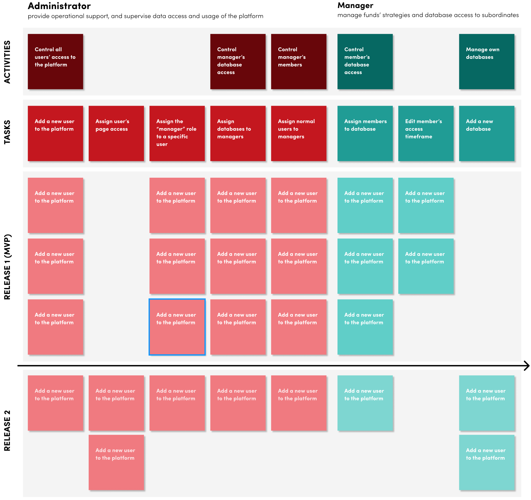
User Story Mapping
After we clarify the architecture, I proposed to map out the user story for the admin and manager, which helps team alignment, product discovery, and feature prioritization in an agile environment.
Design Iteration Highlight - Toggle vs. Select
After we designed the MVP version, I proposed a better solution for users’ access control experience during the development process, which aimed to improve management efficiency and clarity.
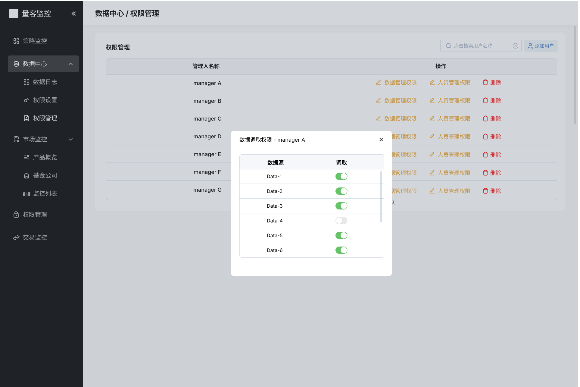
Before
The admins use toggles to open and close managers’ database access. What if we have more databases in the future?
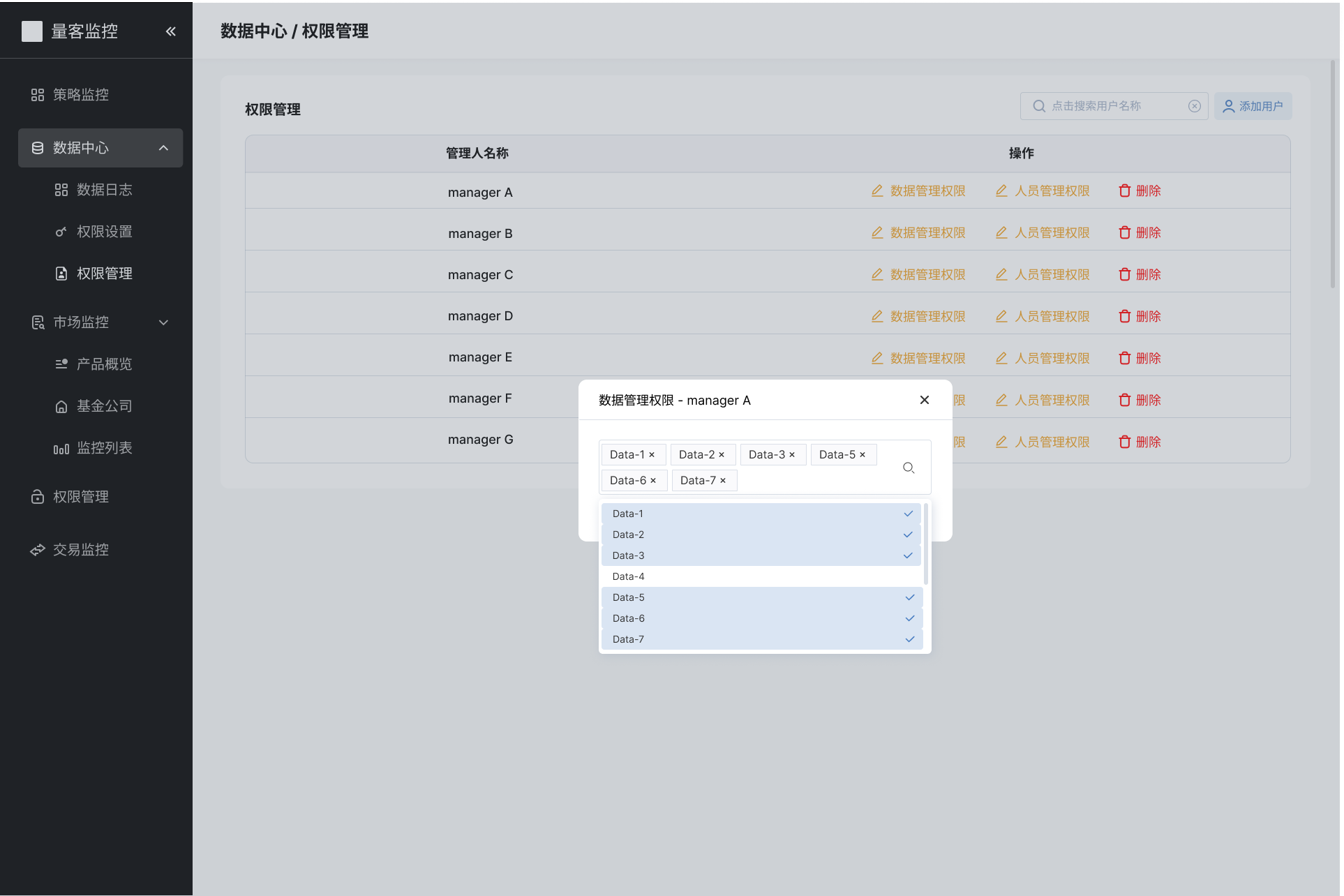
After
Admins have a quick overview and be more efficient when adding (select + search) and deleting managers’ data access
Design Highlights —
02 MARKET
01 DATA CENTER
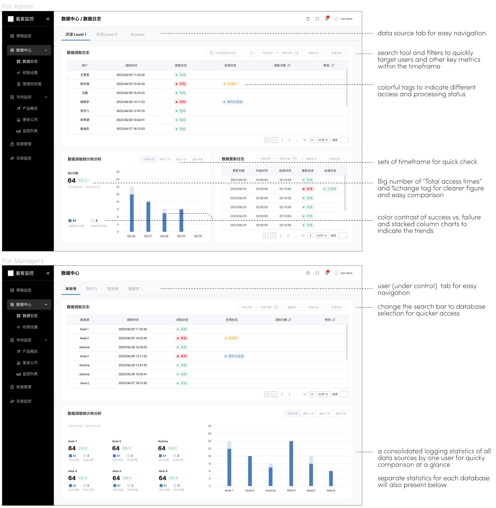
Data Logging Review
Data Logging Review
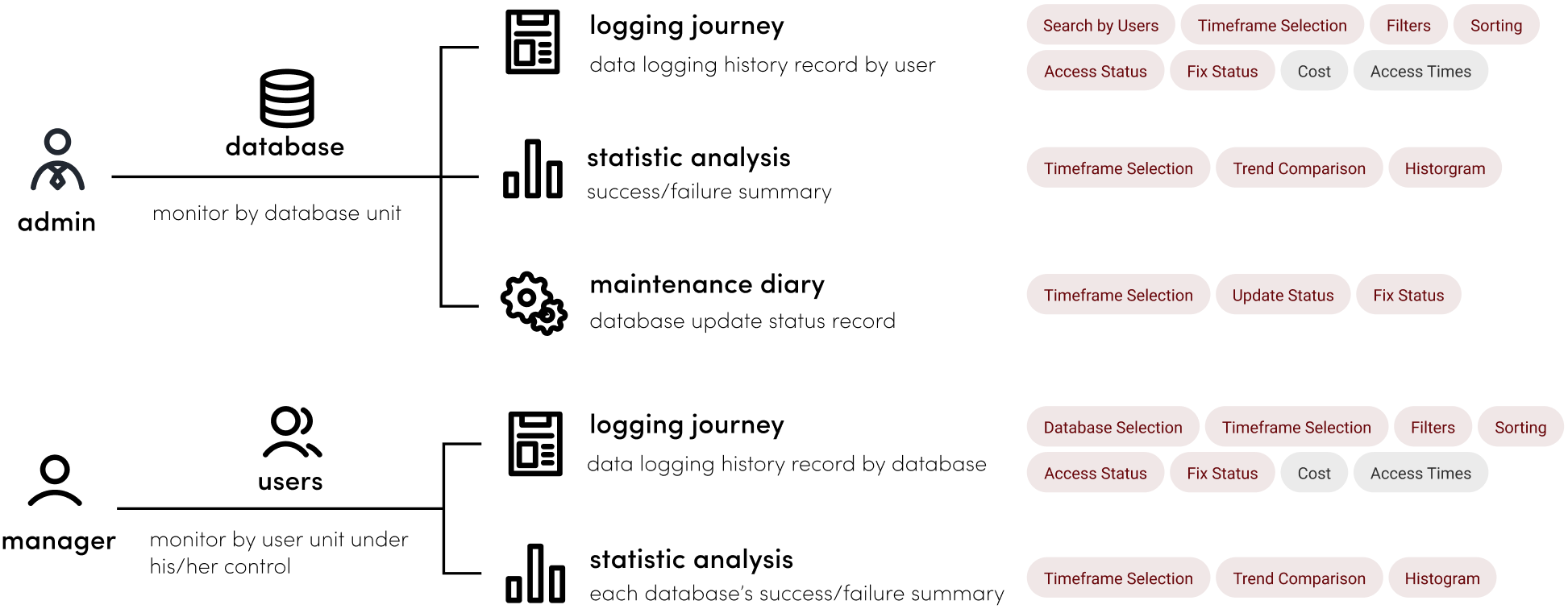
The leadership team wants to review the database logging history either by database or by users. After conducting the stakeholder interview, we finalized the architecture with tentative features.
Design Proposal
Below are the basic ideas and tentative design proposals for the data logging history review dashboard. Further modifications should be applied during the development process.
Design Highlights —
02 MARKET
Funds’ Comparative Analysis
01 DATA CENTER
02 Market Monitoring —
Quantfund Investments manages multiple products, including Enhanced CSI 300, 500, and 1000 Index Funds, that financial researchers and advisors want to monitor frequently by comparing them with the overall market’s performance. Therefore, our product team reconstructed the Market’s information architecture based on key stakeholders’ needs, and focused on priority features after mapping out the entire structure.
Funds Comparative Analysis
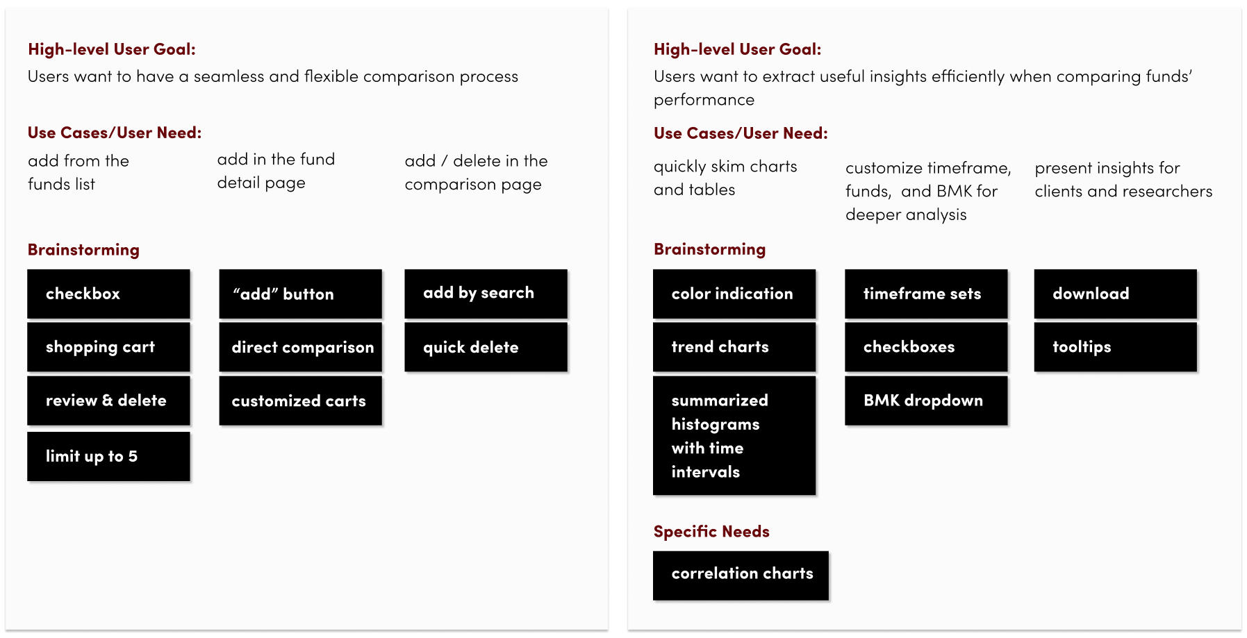
The main target users are fund managers in the sales team. We first clarified the goals and use cases, collected special needs, and then brainstorm feasible solutions for the MVP release.
User goal and use cases
Design Proposal
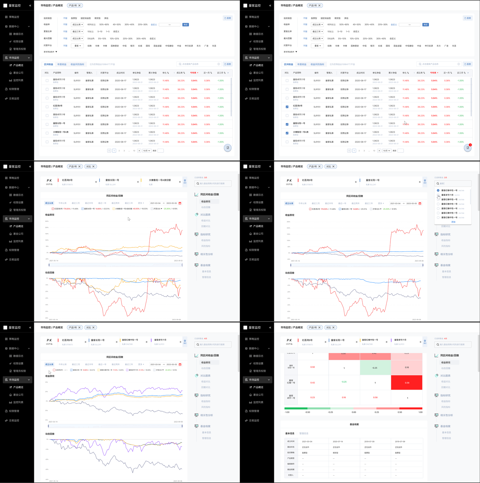
The entire design process and decisions were more complicated. I will present a high-level mockup flows to show the basic idea of the funds’ comparison feature below.
Key User Flow
Step 1: Add funds from the list to the “shopping cart”
Step 2: Click and view the comparison analysis report
Step 3: Easy contrast with the sticky bar and indicative colors
Step 4: Add funds by searching on the right / one-click delete
Step 5: In-depth analysis with checkbox and time axises interactions
High-fidelity Mockup
Design Highlights —
02 MARKET
Risk Factors Exposure Analysis
01 DATA CENTER
Risk Factors Exposure Analysis
Risk factor exposure analysis is often used to indicate the reasoning behind products’ performance compared to the benchmark. They can tell fund researchers if their models are effective. Also, sales managers often use them to tell the story of their strategies during the clients’ review sessions.
What’s the problem?
Current presentation materials directly extracted from Tableau cannot effectively indicate risk factors performance and how it affects their strategy in the short and long term for clients.
presentation material: risk factors performance within 1 year
What to expect?
The executive team wants to routinize the presentation material and keep it consistent and efficient.
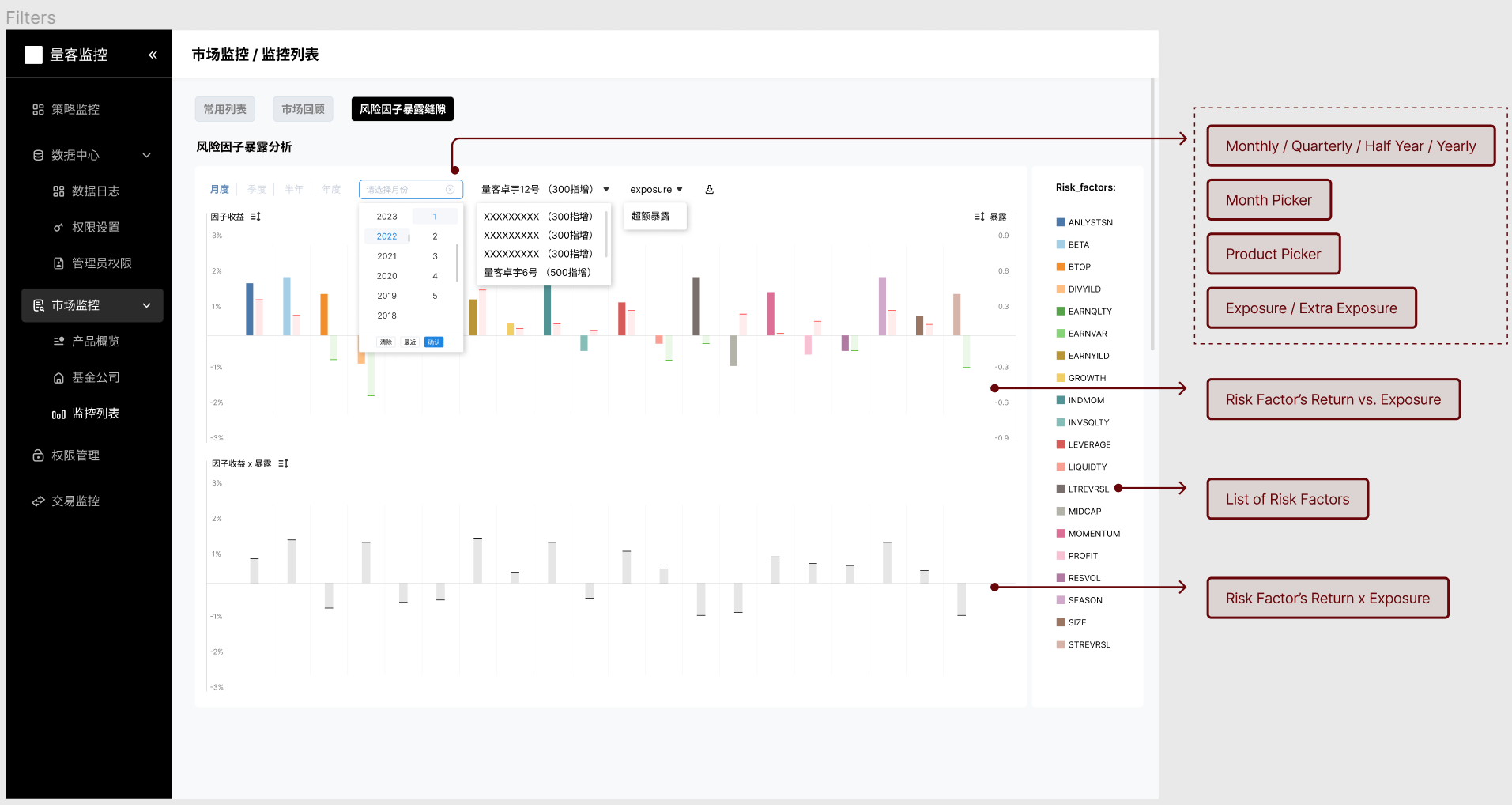
Design Proposal
Different Filters
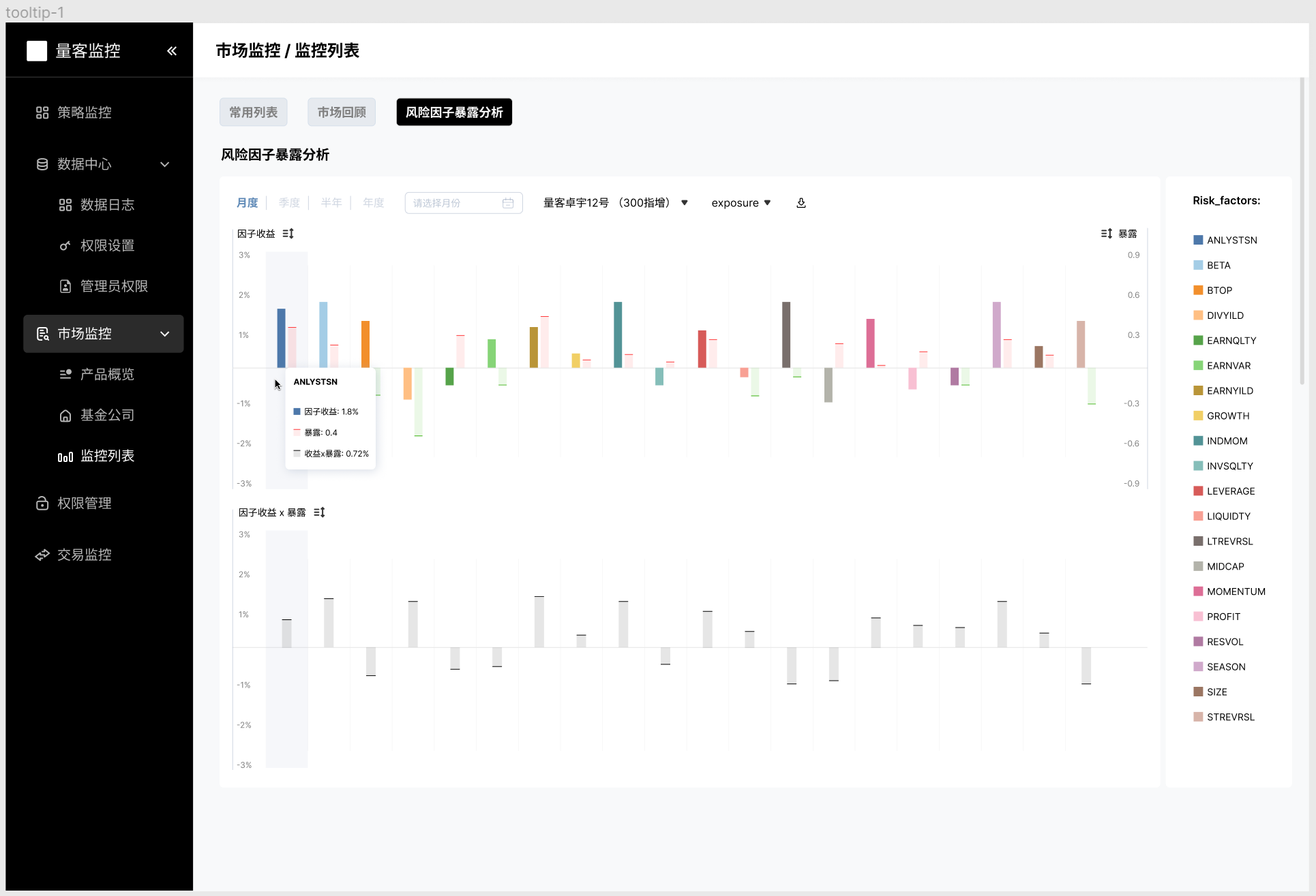
Responsive Tooltips
A same tooptip will appear when the cursor hovers upon the corresponding histograms.
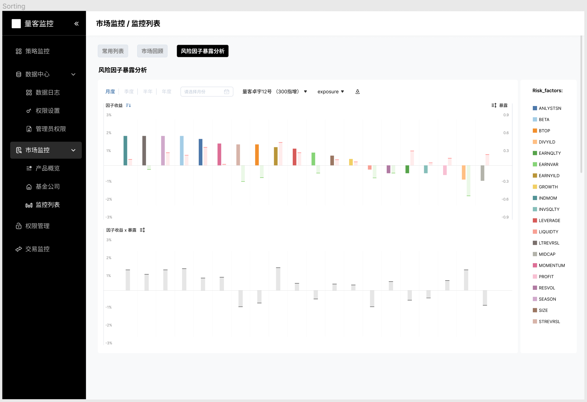
Sorting
Sort by return, exposure, or the product.
Click + Highlight
Click a risk factor on the right bar for quick highlight.
REFLECTION
01 Takeaway —
Agile prioritizes flexibility, collaboration, and iterative progress
With agile, the most valuable features will be developed and delivered first. Also, deliverables are broken down into smaller and potentially shippable increments. This allows stakeholders to provide feedback early and frequently, which can lead to better products.
Informatively simple and intuitive design matters for Data Products
Designing visually inviting data products involves more than just making something "look good." It's about presenting information in a clear, accessible, and aesthetically pleasing manner. That is, we need to understand the audience, use a clean layout, employ consistent design elements, opt for simple visualization, use color wisely, and incorporate interactive elements, etc.
Effective communication is pivotal in product development
Effective communication influences various aspects of the development process and the final outcome. It helps to clarify objectives, improve collaboration, mitigate risks, facilitate feedback, ensure stakeholder alignment, speed up decision-making, set expectations, and finally enhance the product quality.


