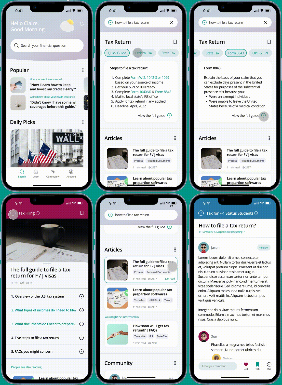
FinLite
Improving international students’ financial well-being in the U.S.
An app that provides simple search and quick learning to solve users’ financial questions
Role:
Individual work
Researcher & UX designer
Timeframe:
Oct - Dec, 2022
Tools:
Figma
Google Form
Mentor:
Mia Zhu (Google UX Designer)
OVERVIEW
01 The Problem —
International students face lots of challenges when studying abroad because of language and cultural barriers. One major challenge is financial management because: 1) different countries follow different financial rules and systems; 2) many students lack systematic financial education when they grow up.
“I wish to apply and build my credit score at an earlier stage.”
Yixing / Chinese
“Tax and insurance-related problems are often confusing.”
Arjun / Indian
“It would be helpful to learn money basics and prepare for the future.”
Seong-Min / Korean
02 The Value —
Therefore, I started the project with a “vague” problem statement:
How can we help international students better manage money in the U.S.?
If such problem is solved, international students are able to:
Feel financially secure and confident in the U.S.
Build a healthy relationship with money and achieve big life goals
03 Solution Proposal —
I proposed to build a mobile app that helps international students in the U.S. enrich their financial learning experience and get their financial questions solved in a clear and quick way.
Feature 1:
Quickly Solve Financial Questions
International students will get clear answers and advice from different sources to quickly solve their financial questions.
Feature 3:
Daily Wits to Improve Fin-Literacy
International students will be motivated to learn and expand their financial knowledge with playful flashcards and community discussions.
Feature 2:
Guided Learning of a Financial Topic
Provided with systematic and guided learning materials, international students are able to master a financial topic quickly at a high level.
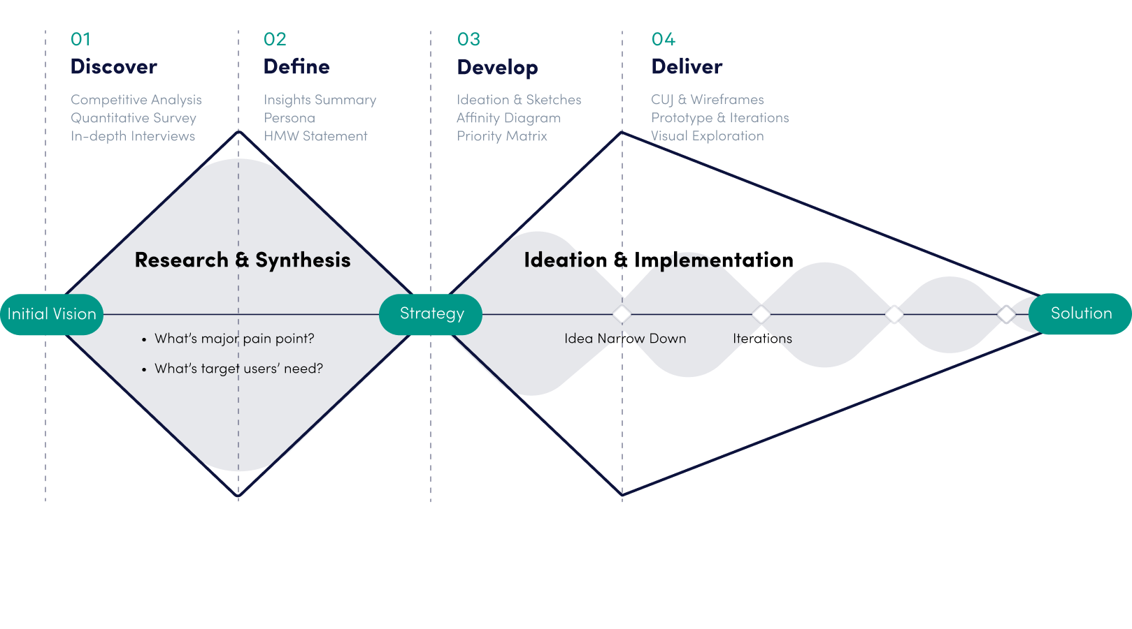
Process Overview —
RESEARCH
01 Idea Validation —
Before diving in, I only had a rough idea that international students need help to improve their financial literacy, both in terms of financial knowledge in the U.S. as well as their financial management skills. However, I am not sure which solution will meet their most urgent need and provide the best value.
Therefore, I quickly sought advice from my peers to get a general idea. The result shows that:
01 Competitive Analysis —
Based on the above insights, I decided to continue focusing on the first three concepts. I targeted several competitors that could potentially meet my target users’ needs. For the analysis, I mainly focused on functions’ availability and their pros & cons to identify nice-to-have features and design opportunities.
Budgeting Apps:
Guide & Community Apps:
I found that:
Current budgeting apps lack informative spending insights and educational content.
Available guide/community apps are not playful and easy to use, and the contents are tedious and not personalized. As a result, international students are not engaged to use.
There is no financial management app that’s specifically tailored to international groups and no guide/community app that mainly focuses on financial topics.
REDEFINED PROBLEM STATEMENT #1.0
How can we create an informative yet easy-to-use platform to help international students learn financial basics in the U.S. and build money management skills?
03 Primary Research —
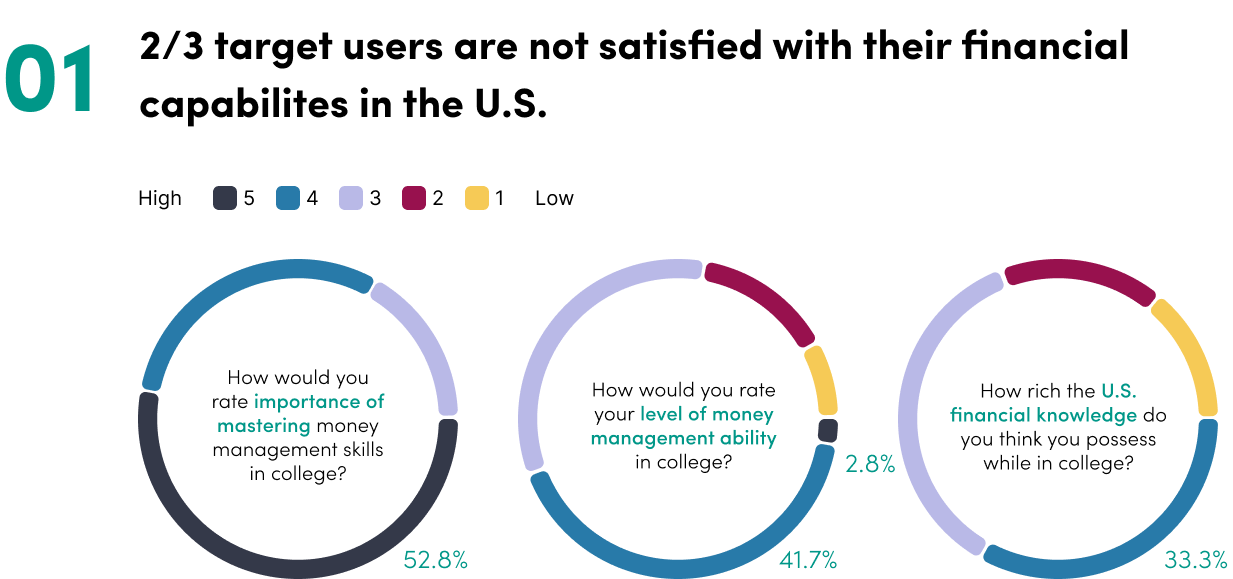
To fully understand target users’ needs and wants, I conducted quantitative research to collect first-hand feedback. I drafted a google form containing 15 questions that were tied back to my initial-stage insights & #1.0 problem statement. Then, I reached out to 40 international students in the U.S.
The primary goal of this survey: learn about international students’ experiences of managing money in the U.S., what obstacles they have ever encountered and what additional help they would need.
Quantitative Survey Key Findings
Based on the insights, I proposed 3 solution concepts:
“Financial Management Platform” to help target users learn basic money skills from practice
“Learning Center” to help target users get familiar with U.S. financial basics and learn money concepts
“Community” where international students can discuss financial problems and share their experience
How to prioritize functions that will benefit the most international students while provide unique values, but now there are no good solutions?
Exploratory Interviews
To dive deep into unclear survey answers, further clarify target users’ pain points, and validate desired features, I conducted five 20-min one-on-one interviews. I also incorporated the “Participatory Design” approach in this survey. Below are my synthesized interview insights:
Main User Goals:
Then, I am able to narrow down the research topic. I realize that the most urgent and common need for international students in the U.S. is to get guidance when they encounter financial problems. Meanwhile, they are willing to be motivated to learn some financial knowledge at a high level.
REDEFINED PROBLEM STATEMENT #2.0:
How might we design a comprehensive knowledge center for international students in the U.S. to grasp financial basics, get guidance for financial questions, and improve financial literacy in a clear and quick way?
04 Personas —
Meanwhile, the survey and exploratory interviews allowed me to summarize 2 personas to better guide my later-stage ideation and design by empathizing with the target users.
IDEATION
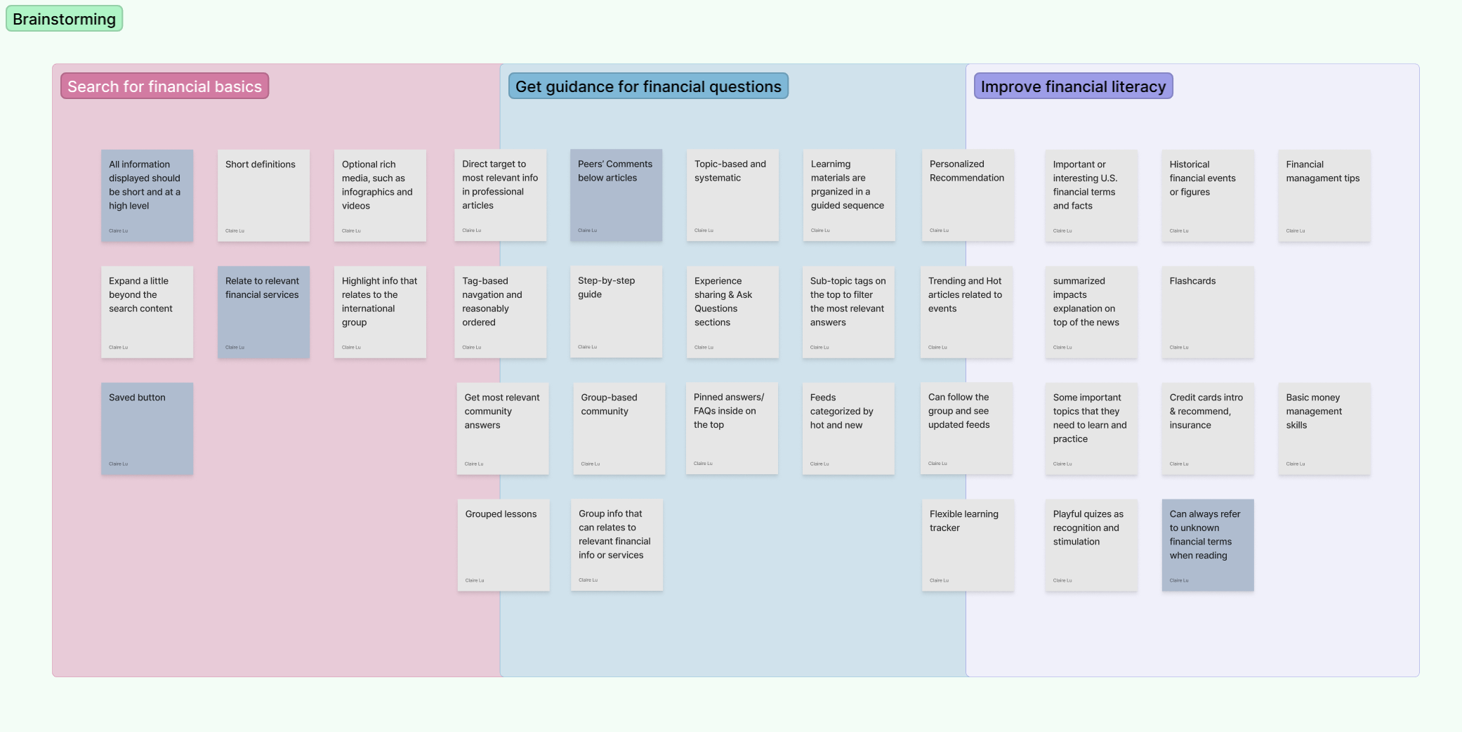
01 Brainstorming —
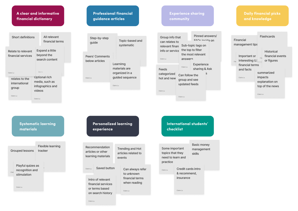
Tying back to the research findings and #2.0 problem statement, I conducted a brainstorming session and categorized ideas into 3 groups to meet major users’ goals. Ideas in dark grey can be applied to all cases.
02 Consolidation —
Step 1: Affinity Diagram
Step 2: Priority Matrix
Step 3: Feature Lists to Build
I grouped ideas into an affinity diagram to help me consolidate and expand feature concepts.
Due to the project scope, I drew a priority matrix and zeroed in on five concepts in quick wins and major projects.
I listed features to build under each concept and then categorized them into 3 major user goals. The process helped me organize my ideas in a cohesive vision.
03 Design Principles —
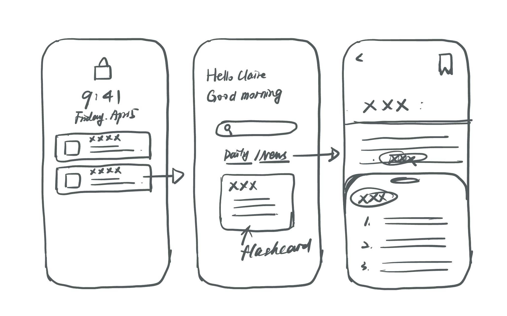
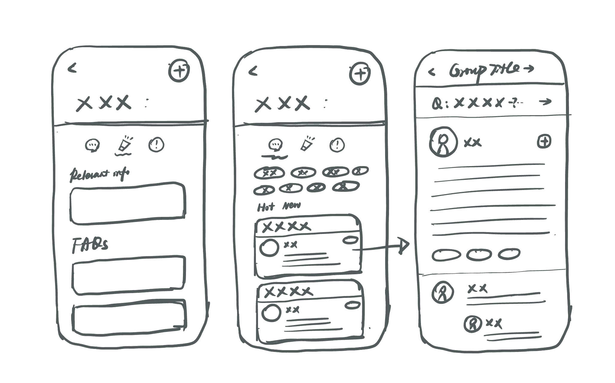
Tying back to the interview insights, target users prefer an easy and quick searching and learning experience. Therefore, I clarified the design principle for each function with sketches to get a feel for what the features would be. This process also helped me diversify my thinking capabilities.
DESIGN
01 Critical User Journey —
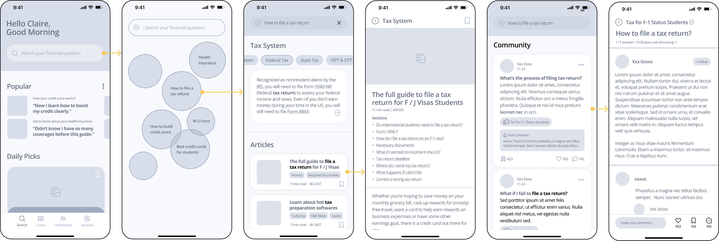
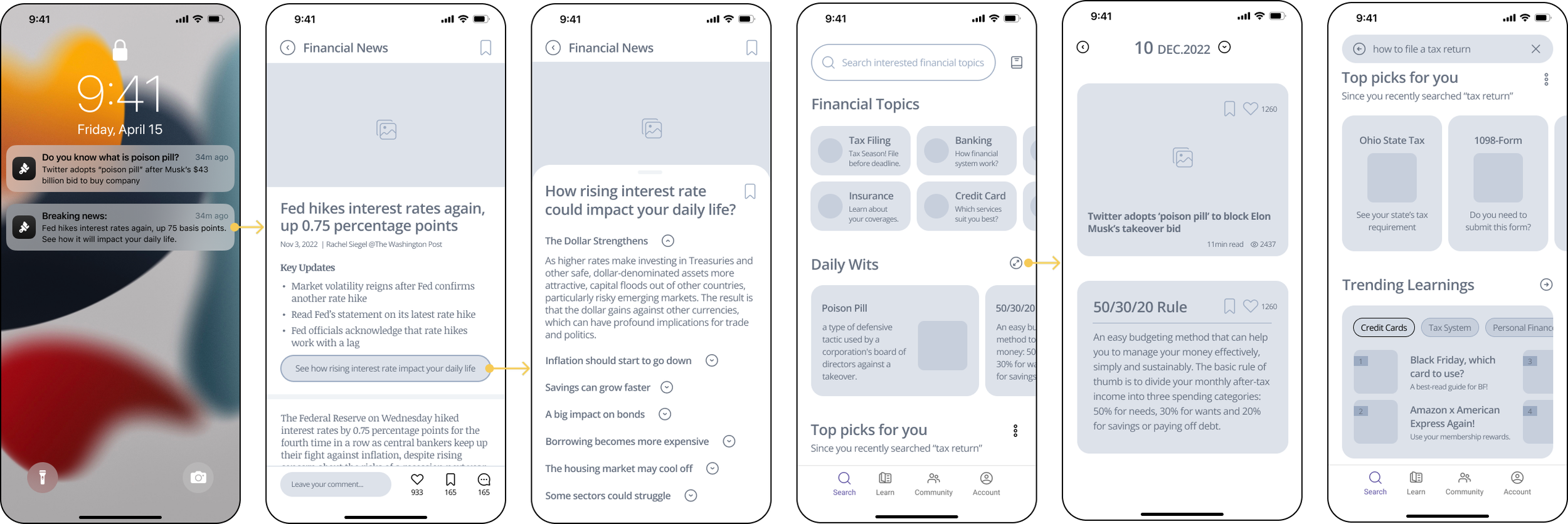
To ensure a seamless user experience, I listed 3 critical user journeys when international students use this tool to fulfill their needs and created mid-fidelity wireframes following each CUJ.
User Scenario #1:
systematically learn about a financial topic at a high level
User Scenario #2:
have a specific question in mind and want to get guidance
User Scenario #3:
be motivated to learn simple and summarized financial wits
02 Iterations —
My primary goal for this first round iteration is to 1) validate whether current design solutions help users meet different needs in terms of financial learning; 2) test the usability of the design so that I can improve upon it.
01 A more playful and interactive financial learning experience
“A misleading information I have is that impacts are just as many as listed but in fact, there might be more. They are clearly displayed but I feel tedious and not engaged to read and learn..”
Design iteration: allow users to swipe flashcards to quickly grasp critical financial concepts and add a discussion section to make learning more interactive and memorable.
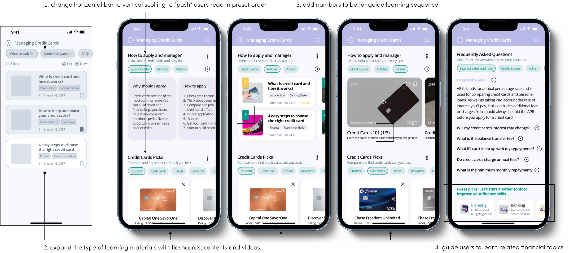
02 Enhance the guided experience when learning a financial topic
“I felt a little bit lost when I first saw this page. I get this when I navigate more but I would expect it more clearly organized, like the search flow, and more types of learning materials.”
Design iteration: enrich the guided and systematic learning experience by reorganizing the content structure to “enforce” users to navigate in a set order and adding “number” elements.
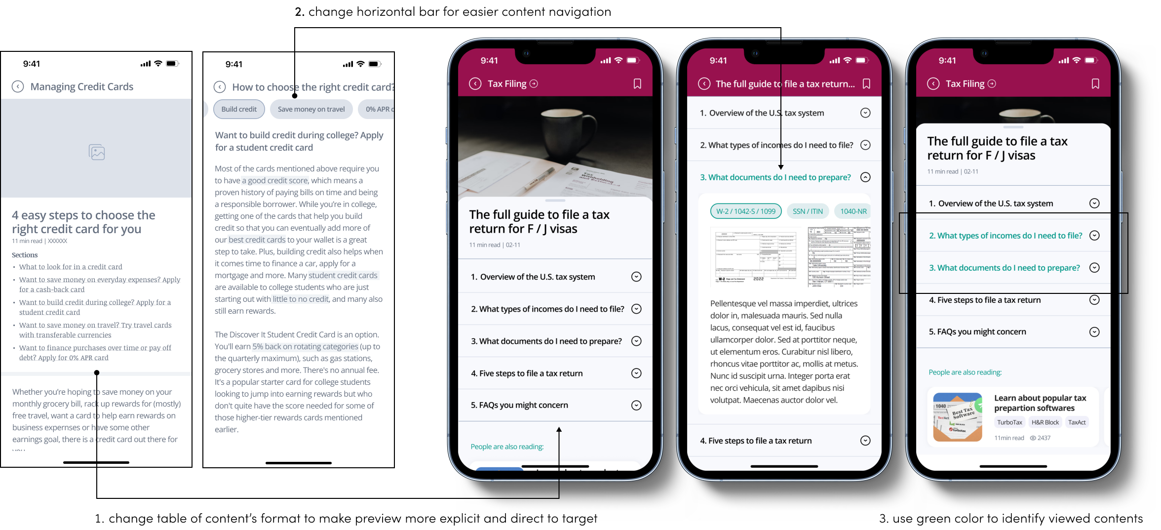
03 Make contents more flexible to navigate and target
“It’s a little hard for me to direct to the information I want. I like that the navigation bar is always on the top, but sometimes I need to continue scrolling, which could be frustrating.”
Design iteration: change the horizontal navigation format to a listed table of content before articles so that users can have a clearer preview and more quickly target information of interest.
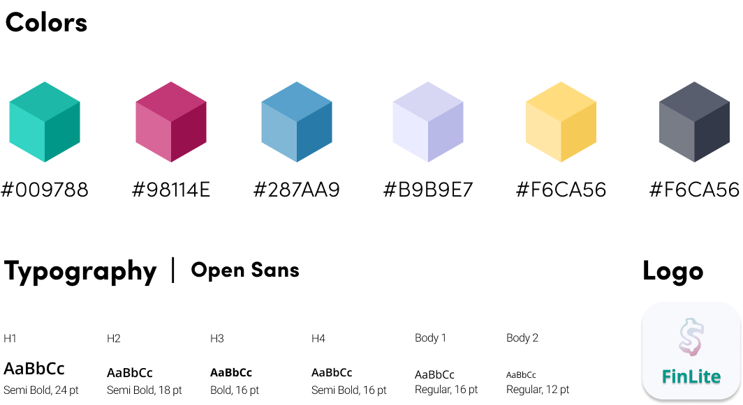
03 Visual Guide —
Use of different vibrant colors to express diversity and playfulness while also match the new generations’ the color trend.
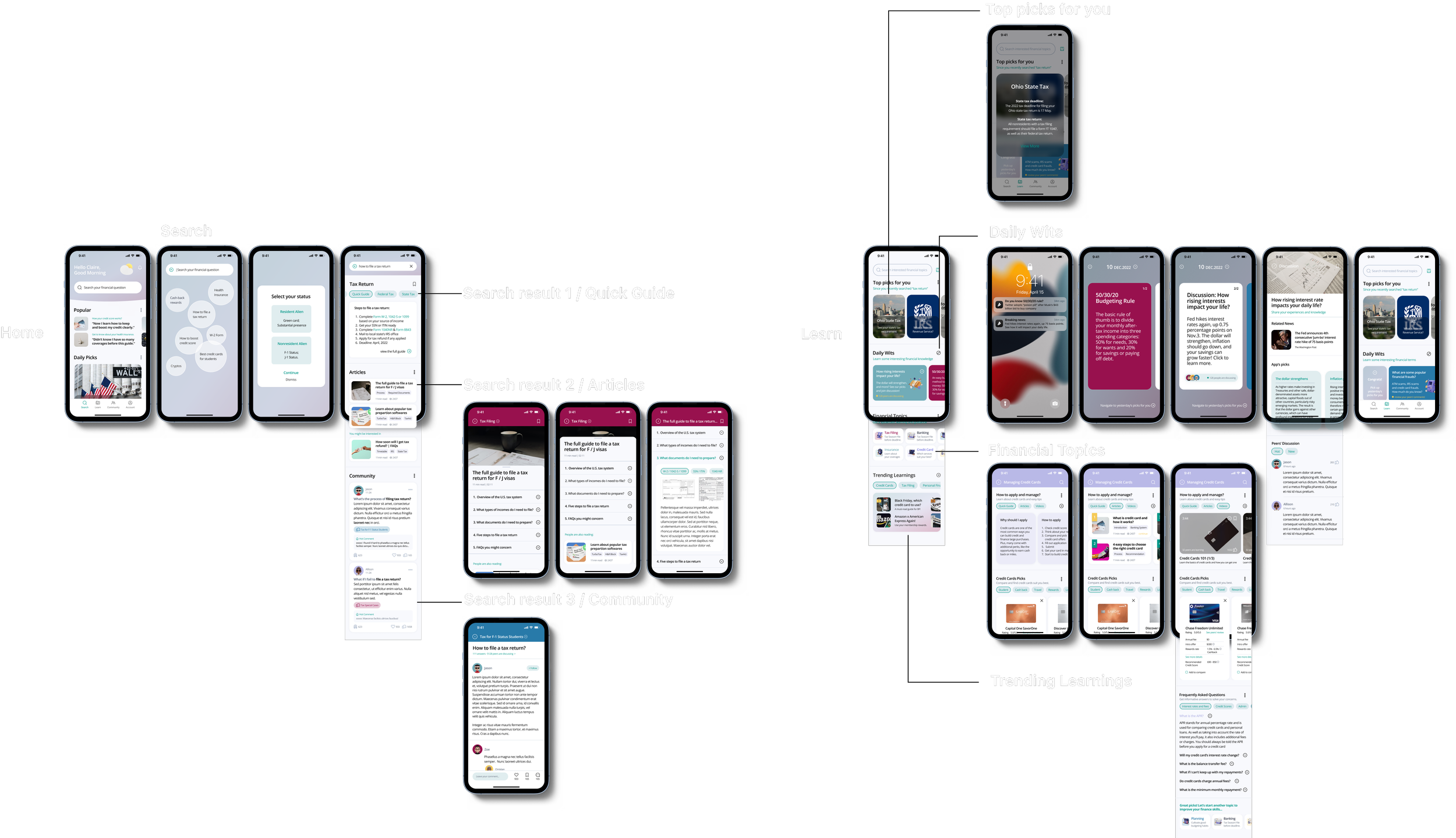
Finalized Design & IA —
REFLECTION
01 Takeaway —
02 Next Steps —
Validate User Needs
Solutions will change, but the foundation of insights will not. When creating design solutions, we should always tie them back to the research findings. That’s why I believe user research and early-stage concept testing are important. I made quite a few pivots when identifying users’ true needs. I am eager to have more training and hands-on experience to improve my human-centric research skills for better design work.
More Varied and Flexible Design Process
In my impression, designers have followed one traditional research and design process for a long time. Guided by my Google mentor, I discovered a new way to define problem statements and a new design method by identifying critical user journeys. I realize that I need more exposure to various design methods, and I also found that the design process should be flexible on a case-by-case basis.
Make elements more visually appealing and interactive
The new generations of tech users have experienced behavior change. I would love to learn more advanced visualization skills to design components and elements in a more appealing and interactive way to engage users and display information in a clearer way to help them digest it more quickly.
Build up community
Due to the project scope, I mainly focused on the search and learning experience. However, the community is also an important part to solve my target users’ problems. And I always believe that a well-designed digital community will bring lots of value to people. Therefore, I would love to build up this section.
Continuous design iterations
A digital product could never be perfect and iterations should be endless. Big thanks to my mentor and peers to help me achieve this MVP version. If I have more time, I would love to continue improving the design.


